R is known to be a very powerful language for the analysis and visualization. For visualizing data, there are better existing solutions that provide quite bit of interactivity with the ActivityInfo data e.g. ActivityInfo's built-in visualization tools, Power BI, Tableau etc.
However, there are number of things one can only do with R like advanced analysis such as prediction, statistical analysis, text mining and so on.
R is a batteries-included language that has many built-in calls for many statistical analysis. Besides, it has external package system that one of the best ones is ggplot that provides powerful graphics to the users.
library(activityinfo)
Build a regression model
We have an example fake dataset illustrating the building maintainance of the high schools in the Netherlands.
We first pull the data from ActivityInfo and we then use R calls to perform analyses. The schools table below is the saved & cleaned version of the data pulled via the ActivityInfo API R client's queryTable() call.
pat <- system.file("extdata", "schools.csv", package = "activityinfo")
schools <- read.csv(pat, stringsAsFactors = FALSE)
head(schools)
#>             school_name date_of_school_establishment date_of_visit   type
#> 1 Amsterdam High School                   1982-01-01    2019-12-04  Paint
#> 2   Tilburg High School                   1986-01-02    2019-12-05  Brick
#> 3     Breda High School                   1882-01-03    2019-12-06  Paint
#> 4 Rotterdam High School                   1922-01-04    2019-12-07  Paint
#> 5   Haarlem High School                   1860-01-05    2019-12-08  Paint
#> 6 The Hague High School                   1982-01-06    2019-12-09  Paint
#>                                                                                                                                                                                       situation_description
#> 1     Lorem ipsum dolor sit amet,\n                                    consectetur adipiscing elit,\n                                    sed do eiusmod tempor incididunt ut labore et dolore magna aliqua.
#> 2  Lorem ipsum dolor sit amet,\n                                    consectetur adipiscing elit,\n                                    sed do eiusmod tempor incididunt ut labore et dolore magna aliqua. Ut
#> 3   Lorem ipsum dolor sit amet,\n                                    consectetur adipiscing elit,\n                                    sed do eiusmod tempor incididunt ut labore et dolore magna aliqua. U
#> 4   Lorem ipsum dolor sit amet,\n                                    consectetur adipiscing elit,\n                                    sed do eiusmod tempor incididunt ut labore et dolore magna aliqua. U
#> 5   Lorem ipsum dolor sit amet,\n                                    consectetur adipiscing elit,\n                                    sed do eiusmod tempor incididunt ut labore et dolore magna aliqua. U
#> 6   Lorem ipsum dolor sit amet,\n                                    consectetur adipiscing elit,\n                                    sed do eiusmod tempor incididunt ut labore et dolore magna aliqua. U
#>   building_value square_meters_of_school is_painted
#> 1        1100000                    1000          1
#> 2         750000                     500          0
#> 3        2750000                    2000          1
#> 4        1250000                    1200          1
#> 5         975000                    1000          1
#> 6         850000                     550          1
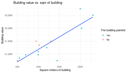
As an advanced analysis, we try to predict the building value based on the square meters of the building. For this analysis we use a linear regression model. On the one column, we have a high school that it has the square meters of the building and on the other column, we have a building value information.
library(ggplot2)

ggplot(schools, aes(square_meters_of_school, building_value)) +
  geom_point(aes(color = as.factor(is_painted))) +
  geom_smooth(method = "lm", se = FALSE) +
  scale_y_continuous(labels = scales::dollar_format(
    scale = 1 / 1e6,
    prefix = "\u20ac",
    suffix = "M"
  )) +
  scale_color_discrete(
    name = "The building painted",
    breaks = c(1, 0),
    labels = c("Yes", "No")
  ) +
  labs(
    title = "Building value vs. sqm of building",
    x = "Square meters of building",
    y = "Building value"
  ) +
  theme_minimal()
#> `geom_smooth()` using formula = 'y ~ x'
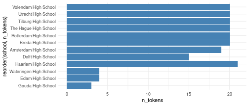
Text analysis
We count the number of words in the description field, which is a multi-line narrative field in the ActivityInfo, and produce a bar chart.
library(quanteda)

n_tokens <- ntoken(char_tolower(schools$situation_description), remove_punct = TRUE)
n_tokens <- as.integer(n_tokens)
df <- data.frame(
  school = schools$school_name,
  n_tokens = n_tokens,
  stringsAsFactors = FALSE
)
df
#>                    school n_tokens
#> 1   Amsterdam High School       19
#> 2     Tilburg High School       20
#> 3       Breda High School       20
#> 4   Rotterdam High School       20
#> 5     Haarlem High School       20
#> 6   The Hague High School       20
#> 7     Utrecht High School       20
#> 8  Wateringen High School        4
#> 9     Haarlem High School        1
#> 10       Edam High School        4
#> 11      Gouda High School        3
#> 12   Volendam High School       20
#> 13      Delft High School       15
ggplot(df, aes(x = reorder(school, n_tokens), y = n_tokens)) +
  geom_bar(stat = "identity", fill = "steelblue") +
  coord_flip() +
  theme_minimal()
For deeper information how the textual data stored in the ActivityInfo is analyzed, please check the QualMiner project.