Best practices for data visualization in Monitoring and Evaluation
Data visualization is an important component in Monitoring and Evaluation. Being critical about data can help get your message across more effectively. Designing visualizations that help spur action, inform our audiences, and support better outcomes for beneficiaries can be challenging. Therefore, one must put thought and care into how data is visualized. In this article, we are looking into aspects and principles for effective data visualization in Monitoring and Evaluation.
Prefer to watch a webinar? You can watch the recording of the webinar best practices for data visualizations to learn more.
Are you interested in how ActivityInfo can support you in analyzing and visualizing your data? Learn more
If you like this article don't forget to register to the ActivityInfo newsletter to receive new guides, articles and webinars on various M&E topics!
You can read this article in French and Spanish too!
Three aspects of data visualization
Before embarking on creating a visualization, we must think about the three aspects of visualization:
- audience
- purpose
- the medium we want to use
Know your audience
The first aspect to keep in mind when visualizing your data is the audience; you must think about who your audience is to be able to shape your visualization. There can be different kinds of audiences that you can be dealing with when presenting your data. Some examples of different types of audience you might come across are:
- Individuals: this could be anyone who takes part in the society, for example, customers you are dealing with
- Partner organizations: where there is a need for mutual understanding of any type of data that you are visualizing for each other
- Donors: your audience can also be donors that may be funding your activities and want to see progress
- Management team or other internal teams: lastly, your audience can also simply be a management team of researchers that want to get more insights from you through visualizations
Best practice: do not add more information or detail than your audience can digest in the time available to them. The key here is to use the right level of details. Before looking at the level of detail you present to your audience, you must think about the level of complexity the audience can handle and how much time they have to digest that information.
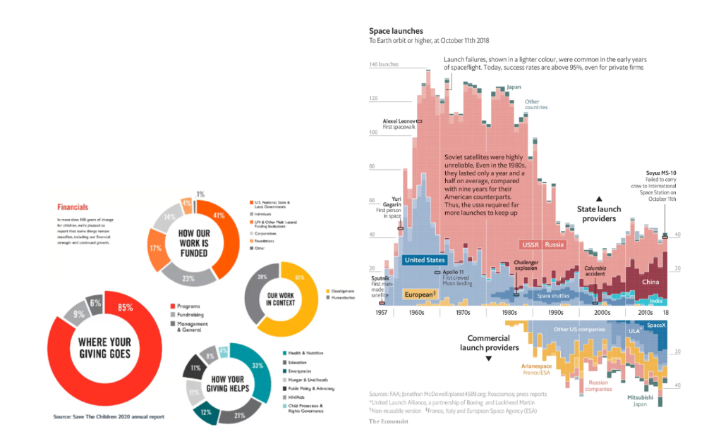
In the image above, we have two examples, the example on the left is for the audience to absorb the information very quickly. The intention is not to grab the attention of the reader for a long period of time. On the contrary, the example on the right is very detailed and is for very inquisitive readers with plenty of time to explore the visualized data.
Browse some visualizations by UNHCR in the East, Horn of Africa and the Great Lakes region in this Case Study.
Identify the purpose
The second aspect of data visualization is looking at its purpose. The purpose of your message shapes your visualization and will help you choose the correct graphic and what type of information to include in that graphic.
Some potential purposes of visualizing your data for your monitoring and evaluation program include:
- Marketing/fundraising: for example, an NGO uses infographics to compel people to donate
- Accountability: for example towards donors or funding partners, where you are presenting information to demonstrate that you are doing the things you have promised to do with the funds awarded to you
- Reporting: progress update or final project report, writing a report on a project where you are presenting the progress update
- Lobbying: influence decision makers to your advantage
A typical visualization seen in M&E is a graphic to demonstrate a funding gap. The purpose of visualizing such a gap is fundraising, where you are presenting a fact;you are in need of more funds. You can also be reporting. For instance, you might be writing a progress report where you want to flag the fact that your project is underfunded.
Another common example in M&E is visualizing realized progress versus targeted progress. In this example, you are tracking indicators which you have as targeted values and you want to present how much you have progressed or in other words how much you have realized the targeted values. So the purpose of visualizing such progress can be accountability, where you are showing that the funds provided by a donor are being put to use, the project is ongoing and is making progress towards meeting its targets.
Best practice: select a chart type which matches the purpose of your visualization.
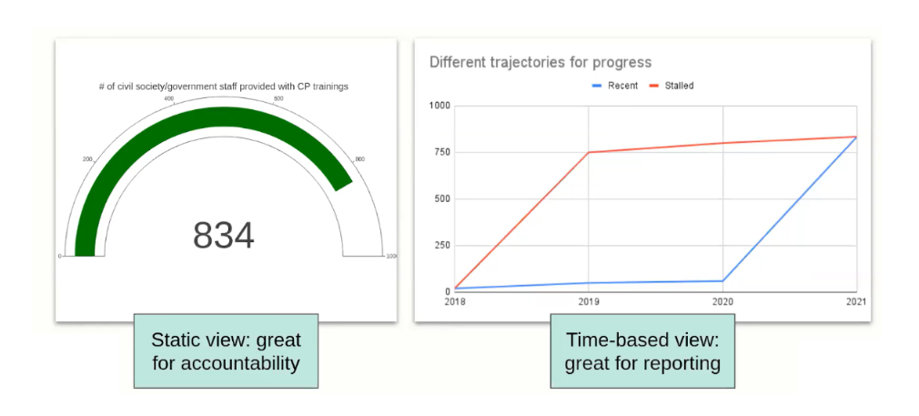
If for example your purpose is to show realized vs targeted progress over time, then you can think of using a gauge metre to show how much progress has been achieved towards the targeted value. However, every chart type can have its limitations, for example the gauge metre in the image above does not tell you how you got to that value.
If you were to include the time axis shown in the image above and were to show progress over time then the visualization on the right could tell you more information about how this progress has been achieved.
Choose your medium
The third aspect of the visualization is the medium, which means where exactly your visualization is going to exist. The most common types of medium in print include reports, articles, sitreps, presentations, posters or infographics. On the web, you can create dashboards, infographics or articles. Your visualization can also be presented in a video form.
Best practices:
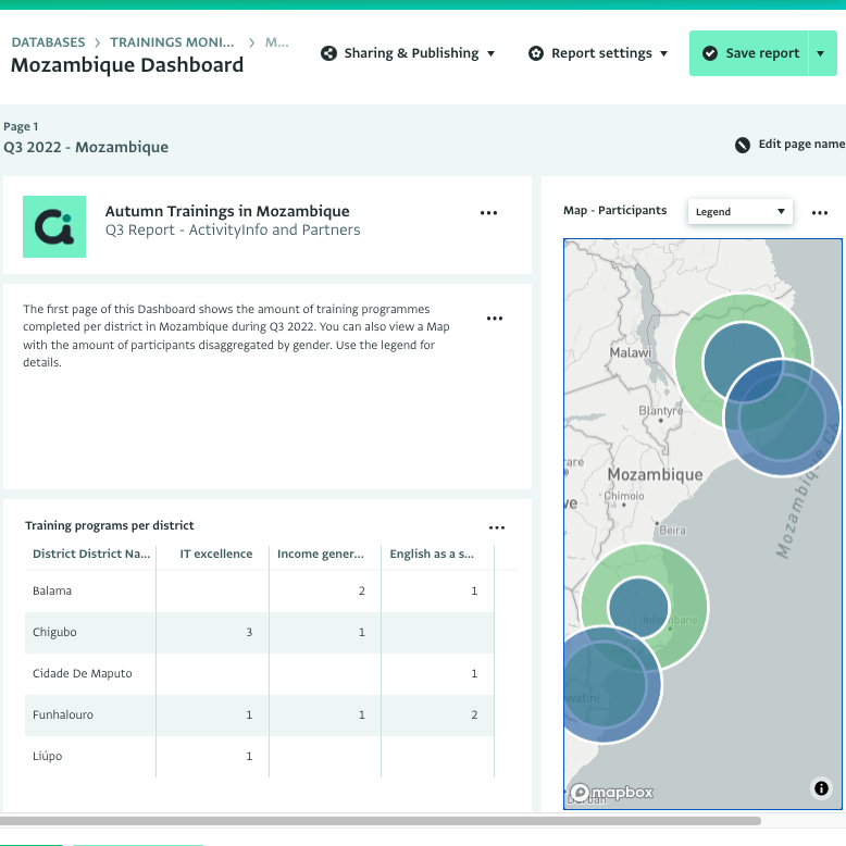
- If you can, choose the medium that allows you to best present your story. For example, dashboards on the internet are generally interactive and can be updated continuously. Donor and partner organizations can ‘drill down’ to select the data of interest to them. Interactive maps are great examples of elements in dashboards. Presenting your data geographically on a dashboard allows your audience to see where you are doing certain activities, what type of activity it is, the impact of the activities on the number of beneficiaries, etc.
- Another best practice is to acknowledge a partner's effort. For example, you can create a dashboard where partner organizations can filter their own activities. This acknowledges that their effort is worthwhile and appreciated.
Take a look at this interactive dashboard created for Multi-partner reporting by UNOCHA Iraq for some inspiration.
Chart types and colours:
Now that you have considered the three main aspects of visualization, you can decide what type of graphic, colours or icons you will use to represent your data and you use.
Chart types:
Some examples of chart types you can use are:
| Purpose | Chart types |
|---|---|
| Compare values | Bar chart or Pie chart or Treemap |
| Present progress | Dashboard metre or Gauge chart or Bullet chart |
| Geographic values | Bubble chart or Choropleth map |
| Time values | Line chart or Bar chart |
| Networks | Network graph or Sankey chart |
Colours:
Colour can have certain connotations for different groups of people. For example, red can represent something in danger or urgency. Therefore, it is important to choose your colours wisely to avoid any misinterpretation of the data you are presenting and to get your purpose across to your target audience.
Conclusion
In summary, it is crucial to identify your audience, choose goals for your visualization and make sure to use the right medium to achieve your M&E goals. Furthermore, choosing the right chart type and colour can help ensure that visualizations help you faithfully and effectively communicate your data in monitoring and evaluation.