Creating map visualizations in minutes
With the brand-new mapping tools in ActivityInfo, you can create visual summaries of your data in minutes. Following the release of Map View which allows you to quickly display all records of a single form on a map, we developed Map Reports which you can use to visualize data coming from more sources. Using Map Reports you can bring in geographical data from multiple sources such as databases, forms and folders and display them on a single map. The only thing needed is for your data to be connected to a geography source such as a geographic point or a geographic area captured with the built-in geodatabase, which you can find in ActivityInfo.
The Map Report page
The Map Report page is part of the Reports in ActivityInfo and is available to all users. Unlike the Map View, the Map Report page allows you to bring in data from multiple sources and has more visualization and styling options. Read more about the Map View and how to create simple map visualizations for your forms.
To design a Map Report, after selecting the data you want to combine, you can quickly add Layers and see the map start forming. Every Layer can be then further customized to display the data in the way you prefer. You can display quantity values as proportional circles and quickly compare the performance of each region. You can also display data as icons, selecting from the wide variety of the OCHA Humanitarian Icons. There are different basemaps you can choose from too.
We will be enriching Map Reports with more features and capabilities so stay tuned!
Ideas for using the Map Reports
In the examples below you can take some ideas to start creating your own Map Reports. Please note that the examples use dummy data and the form structures are simplified. Your programme activities might need different form structures. You can follow a step-by-step guide on adding a Map Report in our User Manual.
Mapping outreach of M&E activities on districts or provinces
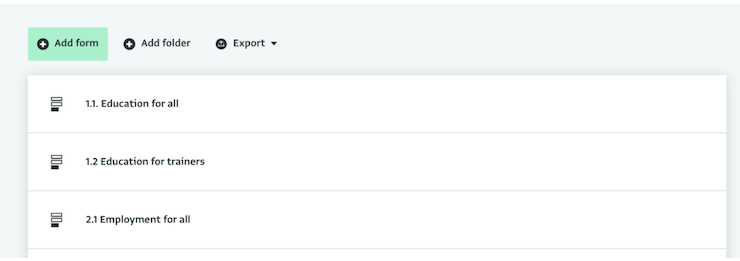
In this example, we will create three very simple forms in ActivityInfo to monitor and map how many beneficiaries we reached with 3 activities in the Districts of Afghanistan. Our forms will reference the ActivityInfo built-in geodatabase in order to include a geographic source. Using the geodatabase ensures that the data collected will be harmonized and that there won’t be duplicates or misspelled locations.
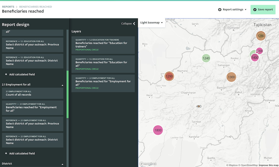
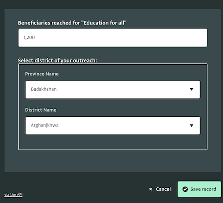
Then, we will add Records to each Form. We will be able to select the District and the Province for which we are reporting.
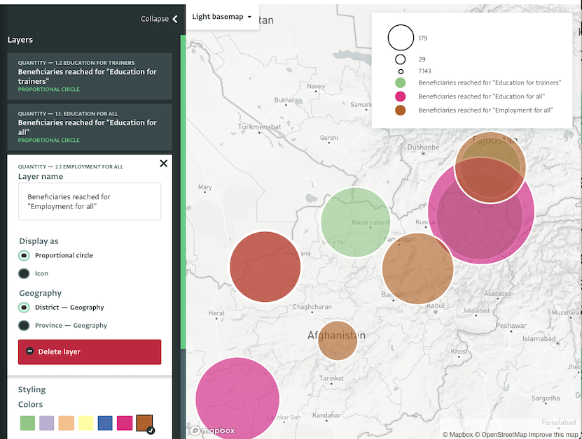
In our last step, we will display the data of the three forms on a Map Report. We will add a Map and select as resources the three forms that we designed. Then, we will add the Quantity fields of each form as Layers. They will appear as proportional circles on the map. Finally, we will customize the way they are displayed by selecting a different color for each type of activity to make the map easier to read and we will save the Map Report.
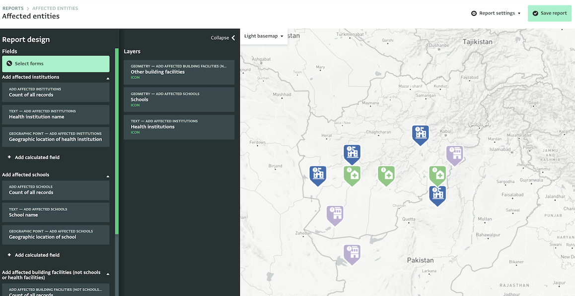
Mapping different types of entities and their status
In this example, we will create a Map Report to display all the schools, health institutions and other building facilities that have been affected by a disaster. We will use Geographic Points instead of the built-in geodatabase to capture the exact location of each entity.
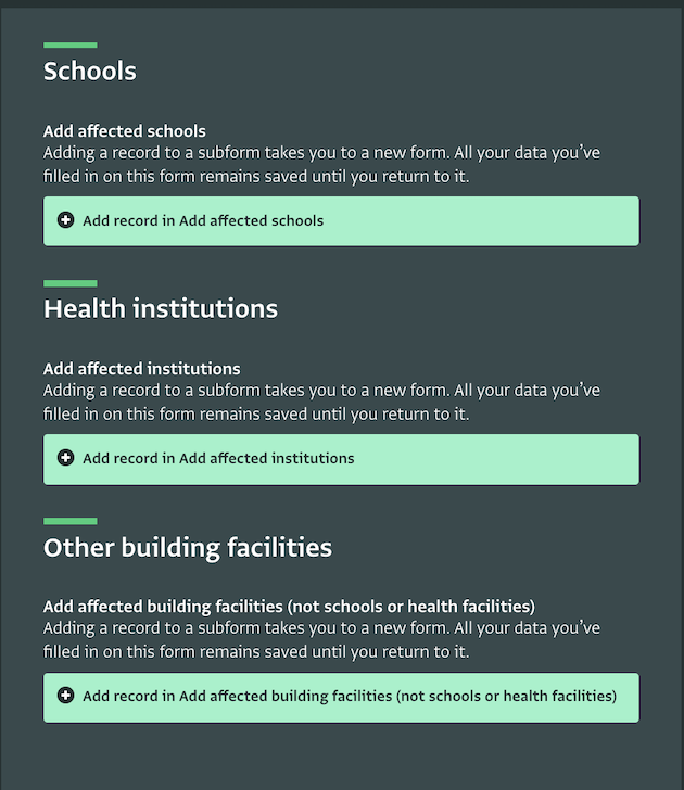
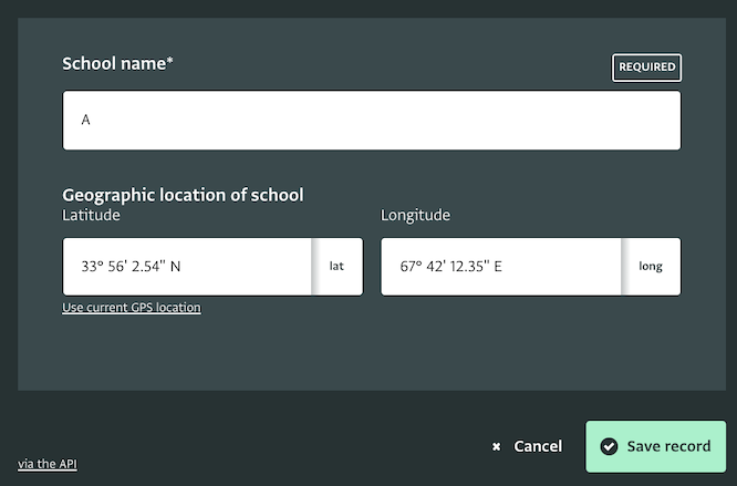
First, we will create a form with three different sections and subforms, one for each type of entity. The first subform will collect information related to affected schools. It will use a Key Text field to collect the name of the school and a Geographic Point field to collect the geolocation of the school. We use a Key to avoid duplicate entries. The second and third subform will do the same but for health institutions and other building facilities, respectively.
Then, we will add data in the subforms. In the Schools subform we need to add as many records as the affected schools are. Then, we need to repeat the process for the health institutions and the other building facilities that have been affected in the respective subforms.
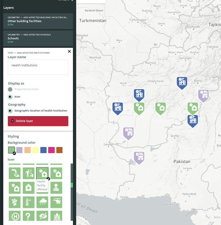
In the third and final step, we will design the Map Report. We will add a Map and select as a resource the form with the subforms we designed. Then, we will add the three types of entities as Layers. We can use the Text field or the Geographic Point field. Finally, we will customize the way they are displayed to make the map as self-explanatory as possible. For the Schools Layer, we will choose the respective icon for ‘Affected School’ from the icons list. By hovering the mouse cursor above each icon, we can view what each icon stands for. We will choose the respective icons for the other two types of entities and finally we will save the Map.
You can visualize your data on various basemaps and get useful insights regarding your activities within minutes; just remember to add a geographic source to your form or subform!
What do you think of the Map Reports? Will you start using them to display visual summaries of your data?