Designing ActivityInfo 4.0: a user-friendly and consistent design to serve all types of user needs
Since 2009 we have been developing ActivityInfo with the objective to make the lives of humanitarians working in the field and in Headquarters easier. Whether their work is in Monitoring and Evaluation, Information Management, Case tracking or project management, we want our users to have a flexible tool in their hands. From the development of maps for the 2012 Mali crisis and the calculated indicators feature designed in 2014 for the Syrian crisis reporting to the advanced user permissions for UNRWA today, the ActivityInfo design has always been ad-hoc and responsive to users’ concerns and needs.
Nine years later, we are channelling all the knowledge, feedback and experience acquired from our successes and failures to a coherent vision of what ActivityInfo is and will be.
By listening closely and focusing on what the users have been saying, these 9 years have acted as a kind of prototyping; we listened to what was important for people in the field and we observed their interactions with the software.
A year ago, during our User Conference in Jordan, we announced ActivityInfo 4.0, a redesigned version of the software. Following a series of releases, the new version is coming to life and has been already adopted by thousands of daily users.
The new, modern and user-friendly version is a result of hard work and cooperation between our development team and two highly talented designers. We spoke with Adrian Egger, multi-disciplined designer focusing on user experience of apps and websites, prototyping and visual design and Peter van Grieken, design consultant at Frozen Rockets who discussed with us how they came up with this design, what was in the centre of the design process, the challenges and the lessons they learned.
Peter van Grieken is the designer of the ActivityInfo website too.
So how do you design an information management system?
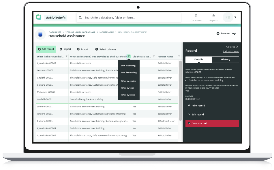
With the focus on simplifying the app for our users, Adrian and Peter created a consistent and user-friendly modern design. Interactions are simpler, quicker and more streamlined in ActivityInfo 4.0. There are less modal overlays (message boxes), clearer error messages (e.g. for lost connectivity or lack of permissions) and more common patterns to help users navigate intuitively from one interface to the other.
“We deconstructed a lot of interactions into its key steps, and tried to find more efficient or more logical ways to have the user go through them. The requirements for what the design could do, and which building blocks were needed to make that happen were vastly different than the V3 app”, notes Adrian.
“We looked at these kinds of interactions and we tried to come up with ways to try to integrate the interface so it would make for a lot more logical flow for a user within the context they were already working”, adds Peter.
At the same time, the design in this version remains consistent by re-using patterns and components. This way users don’t need to re-learn patterns and are able to know what to expect when they use the software.
“The fact that we tried to reuse components that we designed early on in the process, helped us maintain consistency” explains Peter.
I did try to work within a set group of reusable components to keep the process lean and make the development stage more manageable”, describes Adrian.
Before designing anything, it was important to document and understand everything related to the existing application. They examined for example, the way each component works and is used and reused by the application, the way people use each component and the pain points of specific interactions. This process was facilitated by the design knowledge and experience of Peter and Adrian and plenty of discussions with the development and the support team.
Once all points were analyzed and understood, Peter and Adrian created a design roadmap and started 'design sprints' with a specific timelines and deliverables. Only when there was agreement on the suggested solution, would the visual design come into play.
“When the solution in theory was accepted, I worked out the visual aspect. The most difficult thing in any design process is the beginning, and once we had the basic components worked out, we could use the same interaction patterns to make it consistent. When you know what the basic building blocks are, you can reuse them to make new things”, explains Adrian.
Listening to users needs
In addition to the valuable user feedback gathered through the past 9 years, current ActivityInfo users discussed aspects of the platform or worked together with the design team on prototypes where they were provided with some scenarios and they had to perform a series of actions. This allowed the design team to understand whether a solution would be viable and iterate on suggested designs.
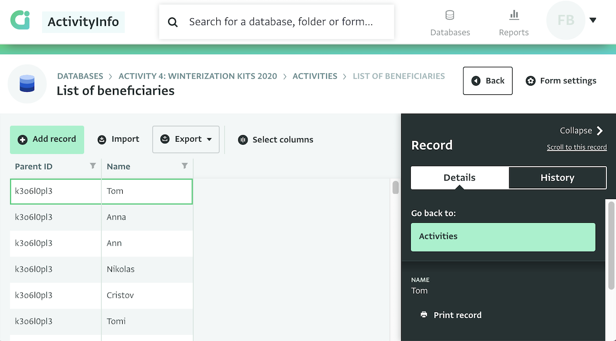
For example, the relationship between Forms and Subforms, a tricky one for new and older ActivityInfo users, was highlighted by adding a subtle animation of sliding from left to right. This allowed users testing the design to intuitively grasp the connection between parent form and subform and navigate easily between the two.
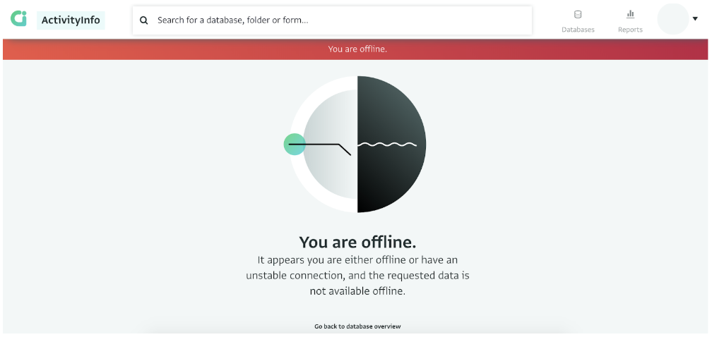
In addition, ActivityInfo 4.0 is designed to manage users’ expectations and provide them with guidance when something doesn’t go as expected. Together with guidance, illustrations help users quickly recognize the type of error they encounter and give more personality to the application.
Accessibility, colours and fonts
As for the colours of the new design, accessibility was focal in any decision, taking into account the technical or situational limitations our users encounter.
Certain tones were selected to improve contrast and highlighting and to allow other colour combinations. As many of our users work with low contrast screens, very small screens or low resolution screens and they sometimes use these devices under very bright light, it was essential to design with these factors in mind.
Peter explains:
“We did take accessibility into account for the colors we used, making sure that there’s enough color contrast between the text and the background. This helps people with limited vision, but also users who want to do data collection in the field in bright sunlight.”
As for the font used, there was a need for a font designed to match the ActivityInfo and the BeDataDriven brand identity which would also include several scripts such as the Arabic, the Cyrillic, the Greek etc. to serve the wide variety of languages that our users work on. The Greta font comes from Typotheque, a type foundry, publisher and design studio based in The Hague and is related to the fonts used on the BeDataDriven and the ActivityInfo website, while it’s designed to serve all these scripts.
Tackling challenges
Being a very flexible tool, ActivityInfo allows users to work with it in a wide variety of ways. From simply doing data entry and using one form to creating complex databases and forms, ActivityInfo users cover both extremes of the spectrum always testing the capabilities of the software. The main challenge of the design was to provide user-friendly solutions to every type of user.
“I think the biggest challenge was the wide range of use cases for ActivityInfo. Some users use only one form for their personal project, others find new, creative ways to stretch the limits of what the application is capable of. Our challenge was to find user-friendly solutions for both extremes on that spectrum. If you need to accommodate for both use cases then you have to come up with ways to serve them both without adding extra complexity for anyone.” notes Peter.
The final result strives to serve all different use cases with the same flexibility as the older versions in a more streamlined and consistent way.
Lessons learnt
On an ending note and talking about the lesson learnt, Adrian states,
“Because we could talk directly to the development team, we could draw on the expertise of Lucy who was working on QA and training, and talk to the end users, I managed to learn a lot of things about database management in a very short time. This is knowledge that I’m sure will come in handy every time I’ll work on a data-related project from now on, which given the global trend to collecting more data, is becoming more frequent.”
“ActivityInfo has obviously been around for years before we started this redesign. That came with a whole set of challenges, because we needed to keep current users in mind throughout the project, but it also had a lot of advantages. Most importantly, because the ActivityInfo team talks to their users often, we could draw on the experience of Alex and Lucy which helped us debunk or confirm some of our assumptions_” adds Peter.
Have you started using ActivityInfo 4.0? What do you think? Don't hesitate to contact us to share your feedback.